Formatting 101: how to format your novel for submission
by Marlys Pearson

One of the things writers tend to obsess over is the proper format for submitting their manuscripts to agents and editors. Stop it, now! Your manuscript should be clean and professional-looking--after that, it's your story that will make or break your submission. So learn a few basic rules--I'm even including a handy-dandy visual guide for those (like me) who sometimes need to see things to really get them--and then stop worrying about how your words look and concentrate on what they say. Because, in the end, that's what's going to sell your manuscript. Proper format is just going to get you in the door.
The number one rule (always and forever) is that if the person you wish to submit your work to has guidelines, USE THEM. Specific requests for font, spacing, margins, etc. supercede anything I'm going to tell you here (in fact, every line below should be read as if prefaced by "unless otherwise specified..."). Always check the agent's or publisher's web page for submission guidelines first.
Disclaimers: I write fiction, and my experience is with U.S. agents, editors, publishers, and typesetters and thus my advice is geared toward American novelists. The guidelines below are based on my experience and research and are to the best of my knowledge current and correct--as with any other advice, take it or leave it as you see fit.
Okay, here we go:
Formatting Guidelines
First
Things that go without saying: Before submitting your work it should be complete and utterly polished, with the bare minimum of typos, misspellings, and grammatical errors. Format's the least of your worries if your writing skills aren't up to par. Remember that Spell Check is not your friend (Google is, but that's a different essay). A spell-checking program will not pick up the misuse of to/too or there/their/they're. It will allow your characters to attic each other instead of attack (I'm not kidding--that happened in a manuscript I read recently). Proof your text carefully and if possible get other people to help, as they will frequently find things you miss.
Font
Font face: There is a growing preference for Times New Roman in the publishing industry,* but some people still prefer Courier. In the absence of stated font guidelines, either is fine (I like Times New Roman myself). Don't get creative, though--stick to one of these two fonts. Nothing fancy, and no sans-serif fonts like Arial.
Font size: 12 point.
Font color: Black. I'd like to think it isn't necessary to say that, but you never know. And use good-quality white paper.

Margins, spacing, indentation
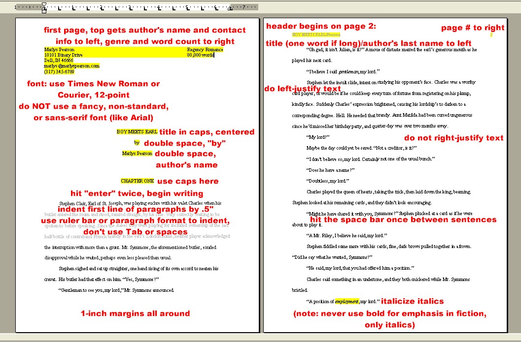
Margins: 1-inch all around.
Spacing:
| Double-space between lines (that's for the body of the manuscript--synopses are usually single-spaced). | |
| One space after punctuation. Back in the days of the typewriter, the norm was two spaces between sentences, and many of us learned to type following that rule. It's very easy to change, though: in Word, go to Edit, Replace, type two spaces in the Find what box and one space in the Replace with box. Then hit Replace All. But of all the things that your manuscript might be rejected for, the number of spaces between sentences is probably among the least-likely. | |
| Do not insert an extra line between paragraphs. | |
| No soft returns (shift + return) anywhere, and regular returns belong only at the ends of paragraphs (meaning, don't use them or a soft-return to get a line to break exactly where you want it to--this will be a pain in the neck for your typesetter). |
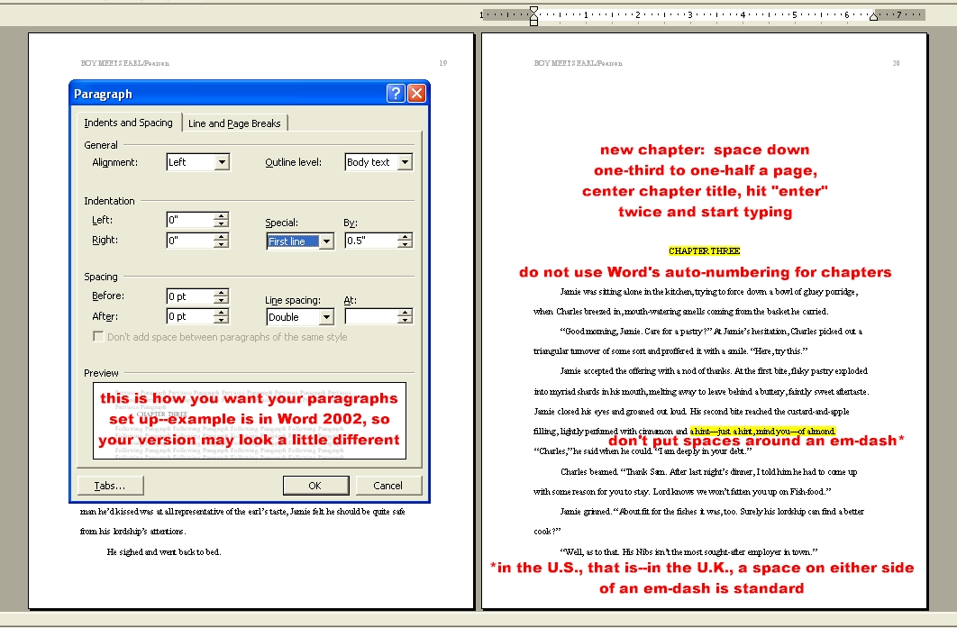
Indentation: The first line of each paragraph should be indented by half an inch (0.5"). In Word, do this either by using the ruler bar at the top of the page, or by setting First line by 0.5" in Format, Paragraph (see picture below). Do NOT use Tab or spaces to indent--this will be invisible on the page, but will drive your typesetter crazy. And it's so easy to do it according to their preferences that in my opinion it's rude not to.

First page, headers, subsequent text
First page of manuscript: Put your name and contact info in the upper left of the page; genre and word count in the upper right (both single-spaced). Word count should be rounded to nearest thousand or five thousand (for instance, I'd leave 72,000 alone, but would round 101,000 to an even 100,000. Why? I think it looks better. So there.).
About a third of the way down the page, put your title in all caps; two lines below put the word "by," and two lines that below put your name or pseudonym if you're using one (make sure your real name is in the contact information, though--they need to know what name to put on the check**). All of these should be centered on the page.
By now, you should have switched over to double-spacing. Hit Enter (Return on some keyboards) three times to drop down a total of six lines, center CHAPTER ONE (all caps), then hit Enter twice more to drop down four lines, begin left justification and start the body of your manuscript.
Do not justify the right-hand side of your manuscript--only the left.
Header: Begin the header on the second page of your manuscript.
| On the left: the title of your manuscript followed by a slash and then your last name. Some people do these in all caps, some in regular text--honestly, I don't think this is a biggie. I use all caps for the title and regular for my last name. If your title is long, just use one or two identifying words from the title instead of the whole thing. | |
| On the right: page number. Begin page numbers on the second page, as well. |
Second and subsequent chapters: Space down one-third to one-half the page, center CHAPTER TWO, drop down four lines (you're double-spacing now, so just hit Enter twice) and begin the body of your manuscript. Do not use Word's auto-numbering feature for chapters (or anywhere else). I'm told that most typesetters use Quark, which will only read auto-numbered footnotes. If you use them for anything else, the typesetter will have to change them all by hand.

More, more, more
Italics: Indicate words that should be italicized in your text by putting them in italics. There. That was easy. Yes, the standard used to be to underline text that you wanted to go into italics, but my typesetter acquaintances say that italics are the new underline. For italics, that is--in non-fiction, underlined text is still used for text that should be underlined in the finished product, but since I can't think of anywhere you'd ever underline text in a novel I'm not even going to mention it. Bold doesn't belong in a fiction manuscript, either.
If you're worried about the old rule and prefer to underline, just make sure you're consistent. I recently judged a contest where some entries had both italicized and underlined text--even on the same page--and I marked them down for it. Sorry, that's just sloppy.
Em-dashes: Should there or should there not be spaces around em-dashes? In the U.S., don't use spaces--this, not -- this. They do use spaces in the U.K., and I've heard of the occasional editor over here who prefers them. But the U.S. standard is no spaces, so unless told otherwise, don't use them.
How to make your typesetter love you: Ideally, a.m. and p.m. should be in small caps. To do this, select text, go into Format, Font, and check the box for Small caps. Again, this is not something that will make or break your submission, but if it will make someone happy down the line, why not?
What document format should you use for electronic submission? In the publishing industry, MS Word is the norm, so .doc files are usually fine. However, for ease of transmission and because virtually any word-processing program can open them, you should probably use Rich Text Format (.rtf) unless .doc is specified.
Should you type "The End" at the end of your manuscript? I do, as a courtesy to the reader--it lets them know the manuscript is intact, with no pages missing from the end.

Huh? Show me!
Okay:


There--hope that helped.
*How do I know? Dammit, I do my research. All my advice is based upon: (1) my own experience with submitting and publishing books and short stories; (2) several years worth of hanging out online with industry professionals including editors and typesetters; (3) Googling for current publisher and agent guidelines.
**Yes, there are ways around revealing your identity even to your publisher, but that's not something I'm going to get into here. Google is your friend.
The End.
Acknowledgments: many thanks to the people who have helped me figure out formatting over the years, especially Mags and Gary. Anything I got wrong is my own fault, and none of theirs.